Recreating the
WIC App
The food plan for women, infants, and children has helped so many people in the U.S. Unfortunately the checkout process for this program creates awkwardness within the people who use this program. This program was heavily researched to make the process a more comfortable one for future users. The problem became “how do we create an experience for WIC users in order to achieve a comfortable shopping experience while also keeping track of expenses and appointments?”
Research
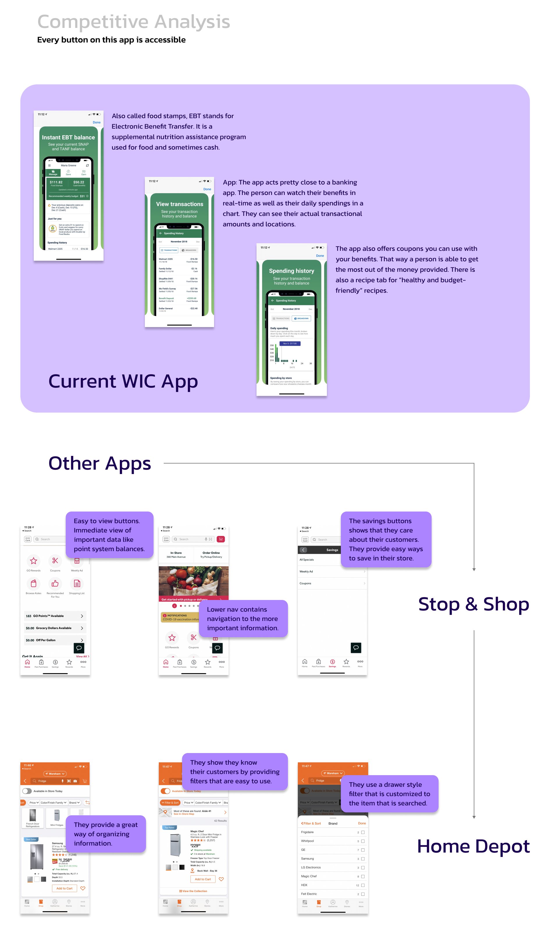
In order to recreate an app, we have to understand the current one. We have to see what is working and what is not. We also have to see what is missing. Included in the research is a competitive analysis of other apps that function similarly.
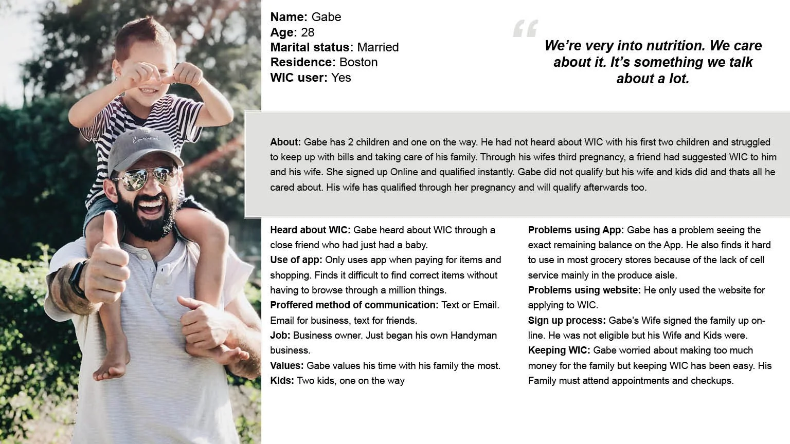
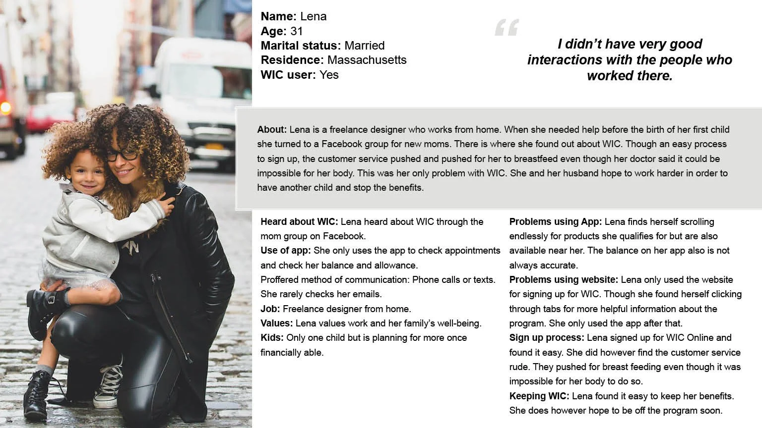
Personas
It's important to understand the demographic of the art we create. With the research I analyzed, I created 3 personas that cover the pain points of WIC users.

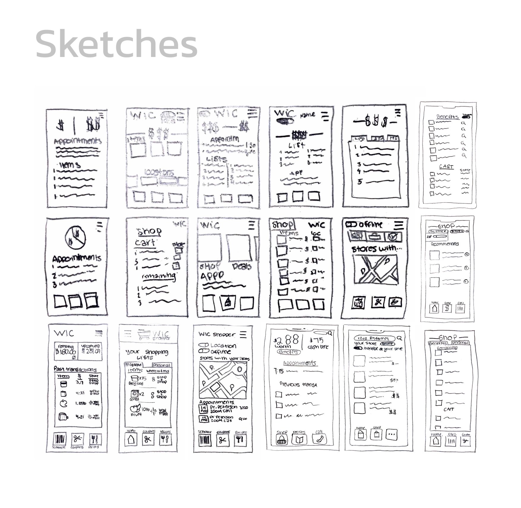
Sketches
I created some high fidelity and low fidelity sketches to organize and plan information for the app. Sometimes as UX/UI designers we have to take our eyes off the screen. I found this to be the perfect time to do that.
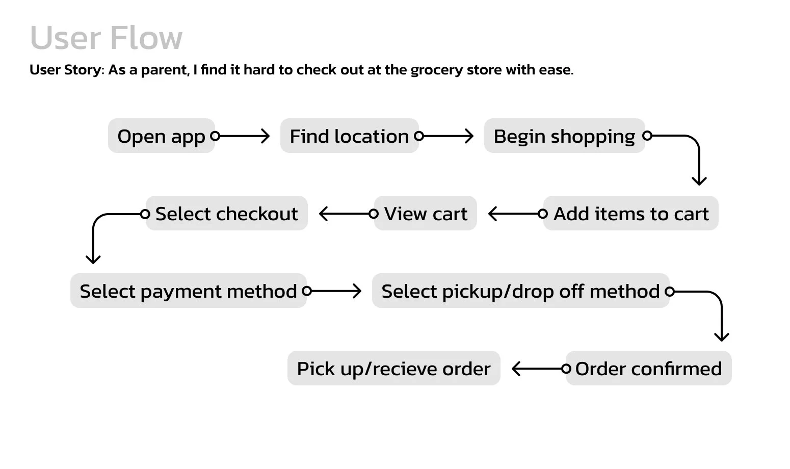
User Flow
A user flow was created in order to organize the app further. The user flow guides users from beginning to end.
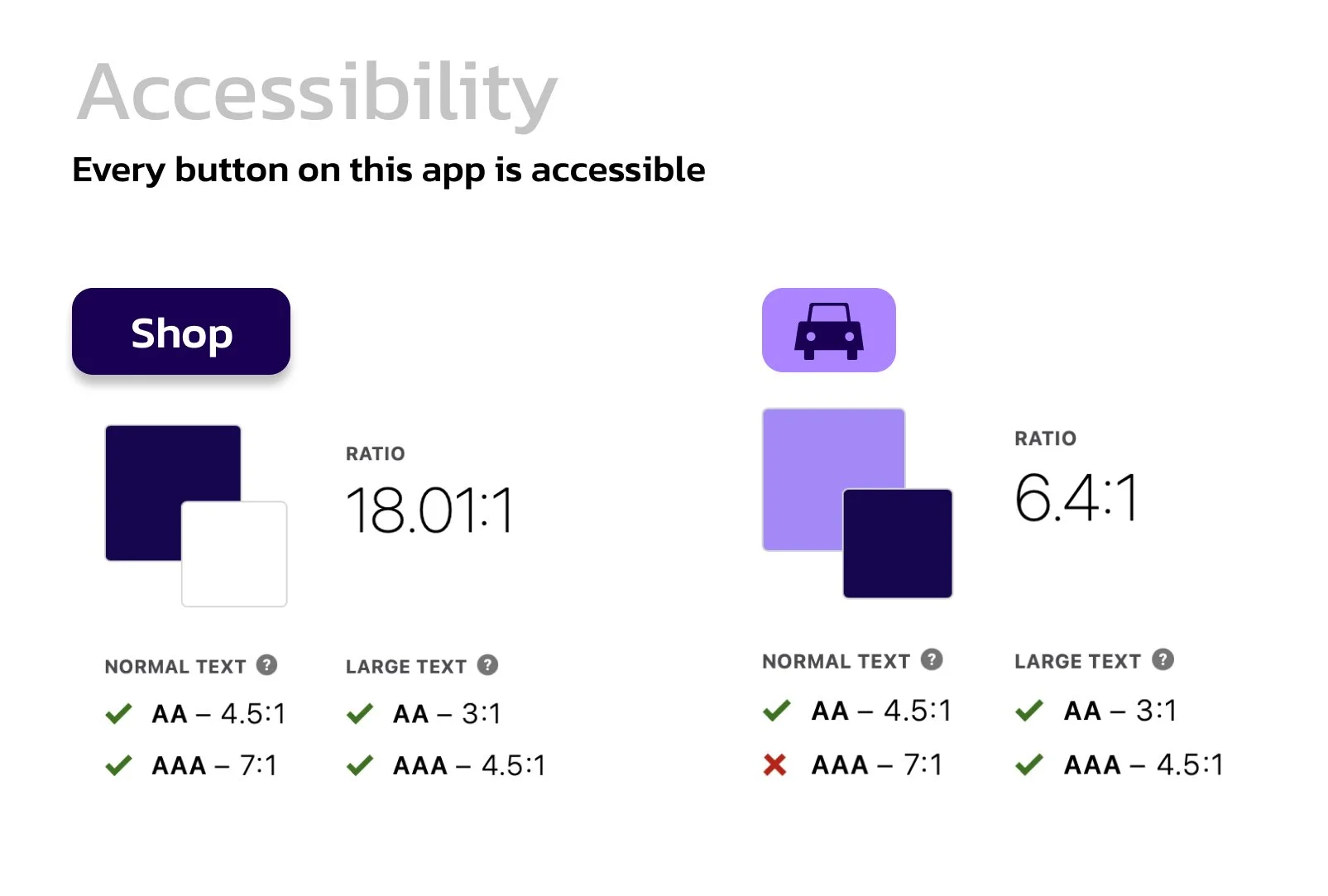
Accessibility
Colors were used with only accessibility in mind. The buttons shown below are in the active state and represent how all buttons are used throughout the app. An accessibility test was run and it had enough contrast to pass.
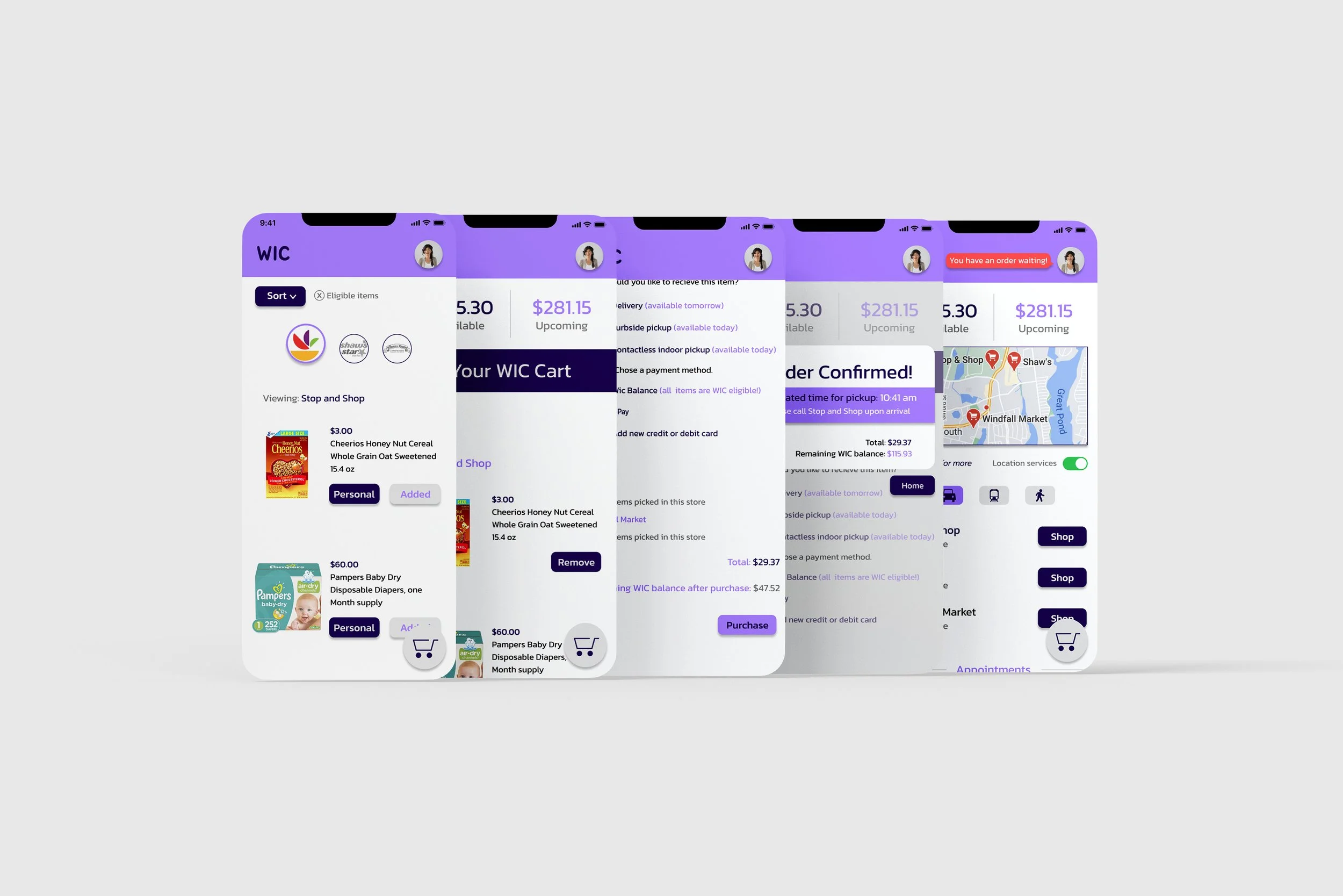
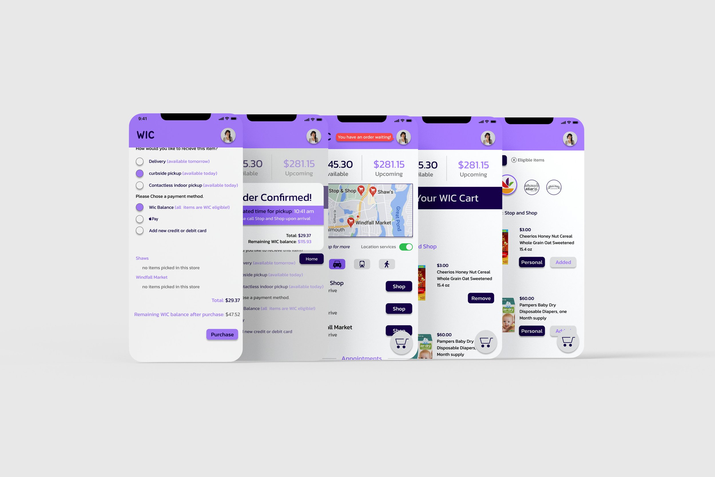
The App
The new design focused on all of the pain points found from interviews and further research. The user is now able to shop in multiple stores while cashing out in one go. If one store doesn’t have an item needed for WIC eligibility, another store will. They can add items to multiple carts to separate personal items they wish to not pay for with their WIC balance. It also saves time in the checkout process for the user and employees. They are also able to decide how they want to receive their order. They can now have their orders delivered or picked up in-store. This creates a more comfortable discrete way of checking out.
The Home Screen
The Home Screen Provides the WIC user with available balances and upcoming balances so they can plan their finances. A map of the closest stores to shop in is also provided with automatic shopping buttons below the map for quick shopping selections. The user can also see how long each trip is according to transportation options in the area.

Scrolling Through
Upcoming appointments are also shown because WIC is more than just a food program. A “Go” button is provided so there’s no need to look up an address for every doctor's office.

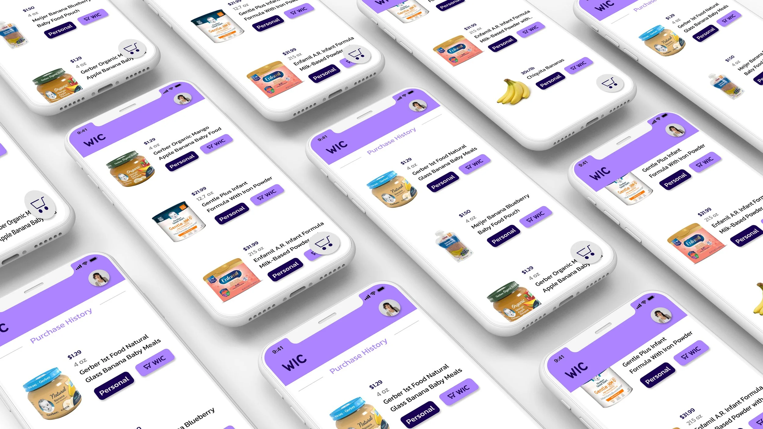
The Shopping Experience
There are two buttons provided under each item. The “personal” button adds the item to a separate cart for non-WIC items. The “WIC” button is located on the right side for easy thumb reach. This button adds the item to the WIC cart. The cart button is the only button in the lower navigation. Once the user is ready to checkout they just have to click that cart button to checkout and adjust their items.
The Checkout Process
After that cart button is hit, the user will be navigated to the Cart overview page. There they can remove items they no longer want. At the bottom of the screen, they can hit the checkout button where they will be sent to the checkout screen. Here they can decide to use their WIC balance to pay and decide how they want to receive their order. Once they hit “purchase” they will get a confirmation pop-up. Their home screen will then show a notification reminding them that they have an order in process.